Warner Bros
- Logo and Custom Typeface
- Direction by Emily Oberman, Tim Cohan, and Tom Grunwald, Pentagram
- Images courtesy of Pentagram
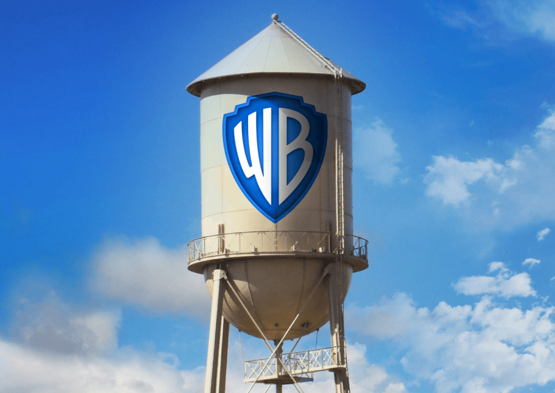
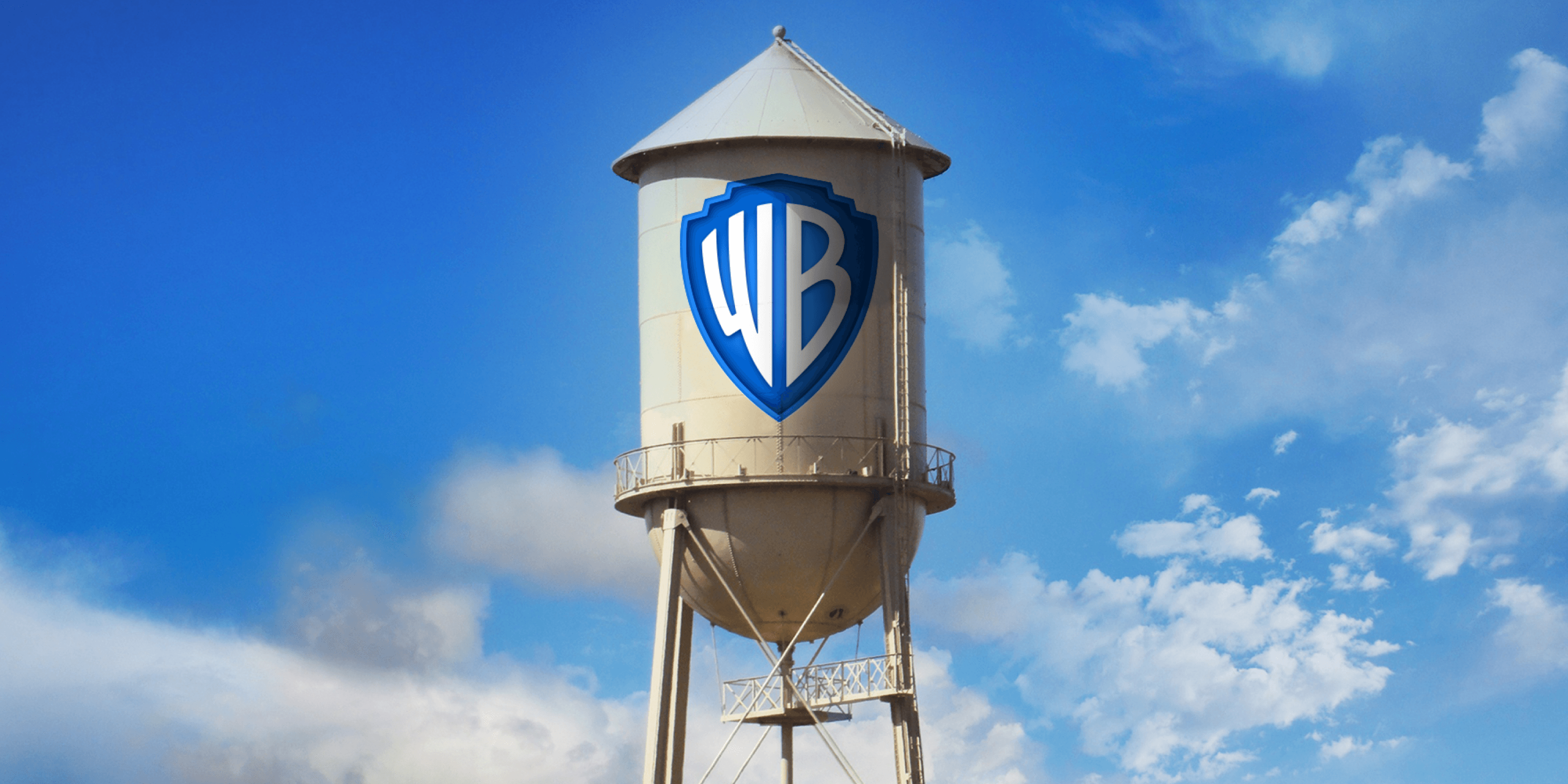
We partnered with Pentagram to develop custom lettering for Warner Bros.’ identity redesign. This included refining the iconic WB shield, featured on their legendary water tower, as well as creating a new wordmark and an original family of typefaces.
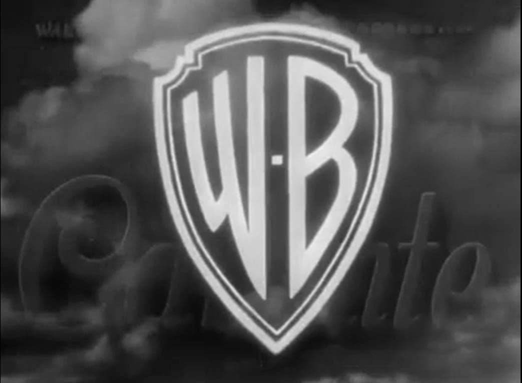
Drawing inspiration from the Art Deco-era lettering found in the original WB shield and the expressive, animated quality of classic sign painting, we created a display typeface that is condensed and tightly spaced. The accompanying text styles were carefully optimized for clarity and performance at smaller sizes.