Atlantic
- Logo and Custom Typeface
- Direction by Peter Mendelsund and Oliver Munday
- Images courtesy of The Atlantic
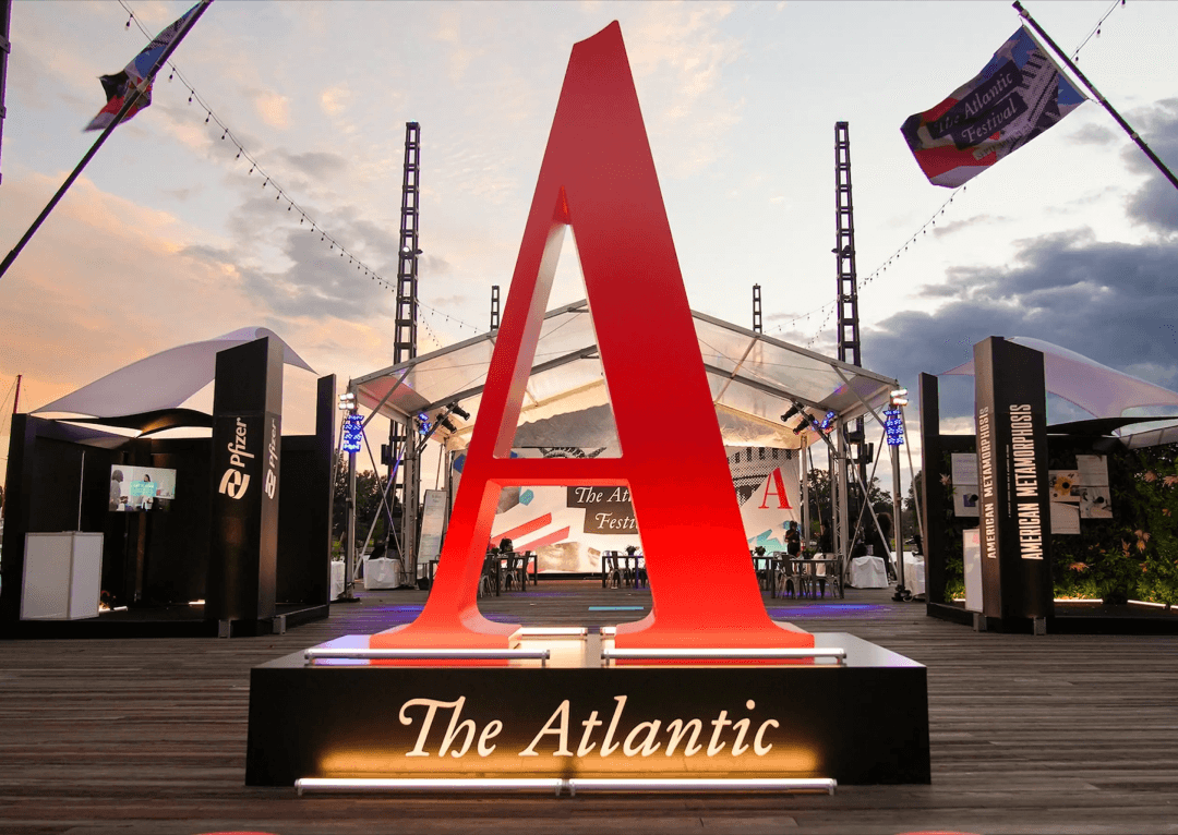
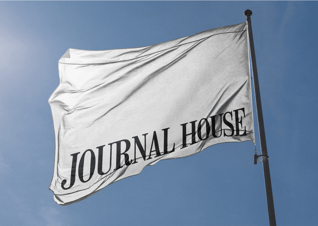
The Atlantic, one of America’s oldest and most influential magazines, was founded in Boston in 1857. As part of a major redesign, MCKL was commissioned to create a new logo and custom display typeface that would honor the publication’s legacy while modernizing its visual identity.
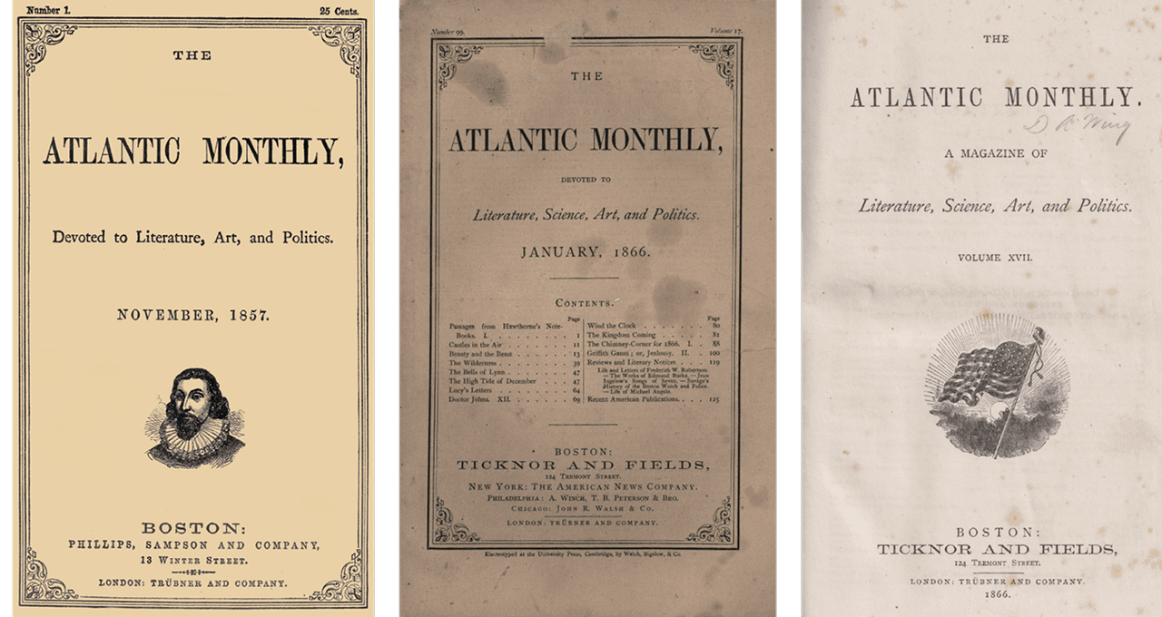
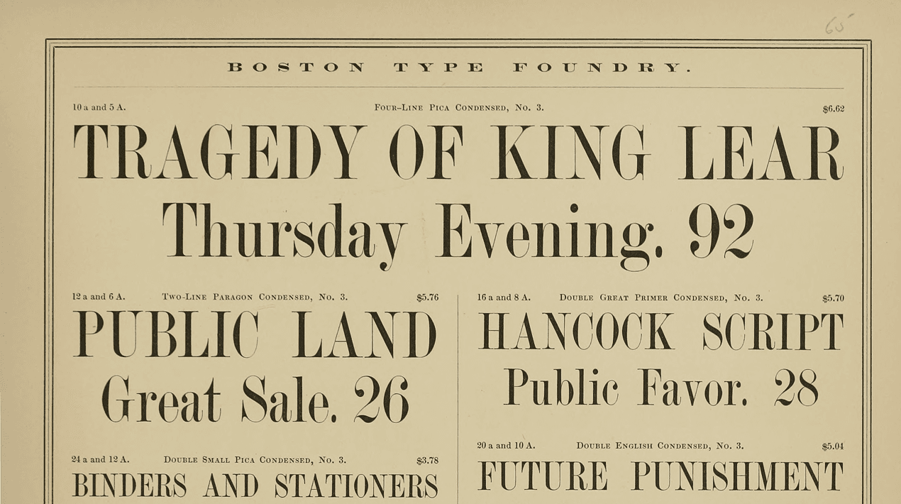
The custom typeface draws inspiration from the nameplate of The Atlantic’s earliest issues. Through extensive research, we traced the magazine’s original typography back to the Boston Type Foundry and its distinctly American interpretation of Scotch Modern fonts. By blending these historical influences with contemporary refinements, we developed a typeface that feels both timeless and uniquely suited to the magazine.
For the logo, we looked to classic American versions of Garamond, particularly those published by ATF and Ludlow, to craft a refined yet authoritative wordmark. The final design features a distinctive “A” and a reference to the magazine’s founding year, reinforcing its storied heritage.
A few years after the redesign, MCKL was asked to expand the typeface, adding new weights, widths, and italics to create a more versatile typographic system that could adapt to The Atlantic’s evolving design needs.