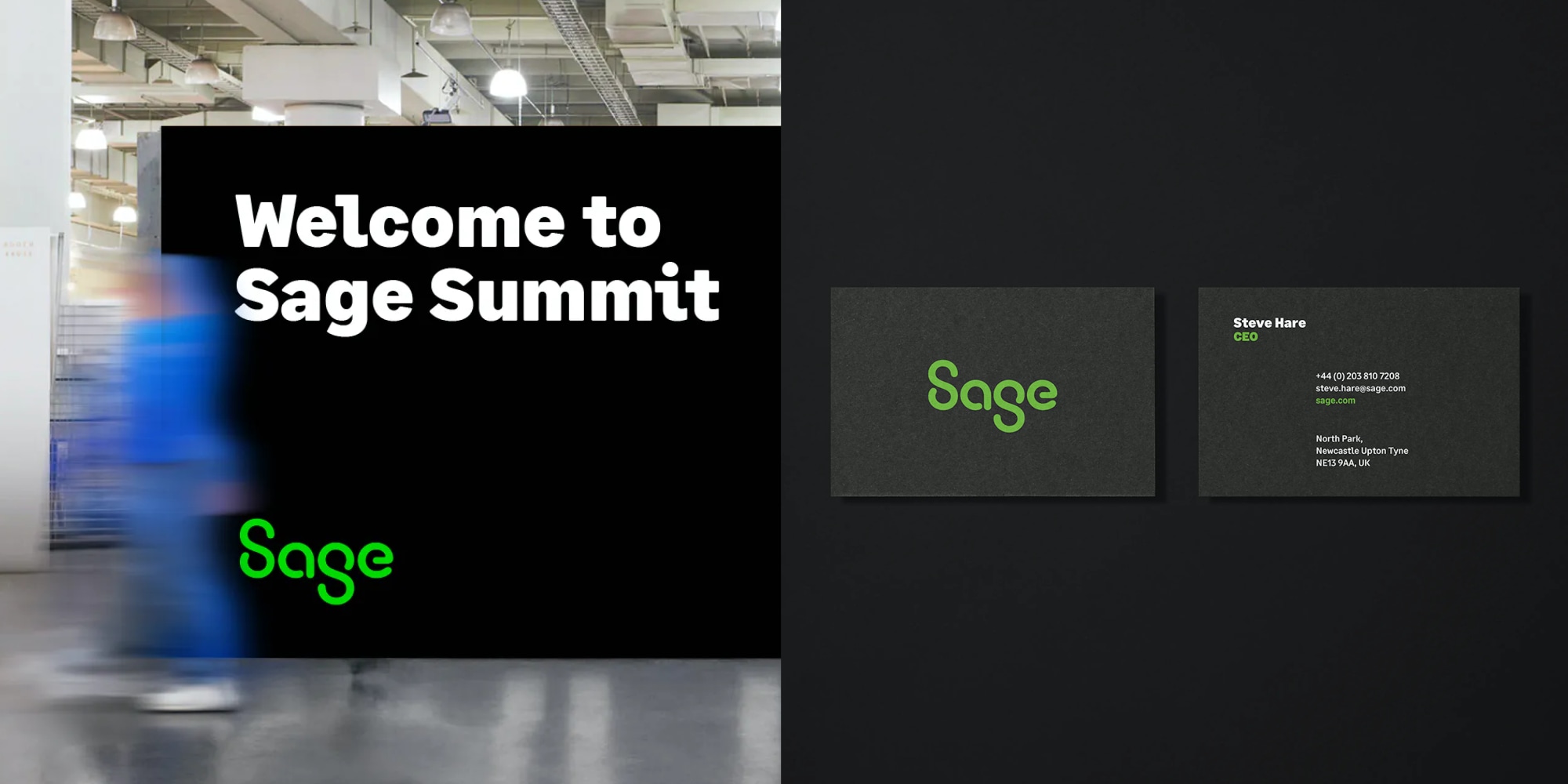
Sage, 2022
Design direction by Wolff Olins:
Forest Young, Dylan Fracareta, and Zipeng Zhu
Sage is a popular accounting and financial services application based in the UK. We worked with Wolff Olins to optimize the logo and develop a custom typeface that would work in app and as a marketing voice for the company.
We optimized the logo and used its principles to inform the typeface: rounded corners, geometric construction, and monospaced qualities. As a company focused on accounting, we knew the numbers would be very important. Unlike other custom type projects, we started with the numerals and let that dictate the design of the entire typeface.
We took inspiration from a wide variety of sources including Optical-Character-Recognition fonts like Adrian Frutiger’s OCR-B, the rounded charm of signpainting manuals, the idiosyncratic structure of Renaissance numerals, and the practical functionality of typewriter, adding machine, and faux-monospace fonts.
Images courtesy of Wolff Olins


