Tester
Specimens
About
Trust is a collection of display typefaces comprising 144 styles across 9 families. The fonts are organized along a continuum of sans to serif, low to high contrast, and light to black weights, in roman and italic styles.
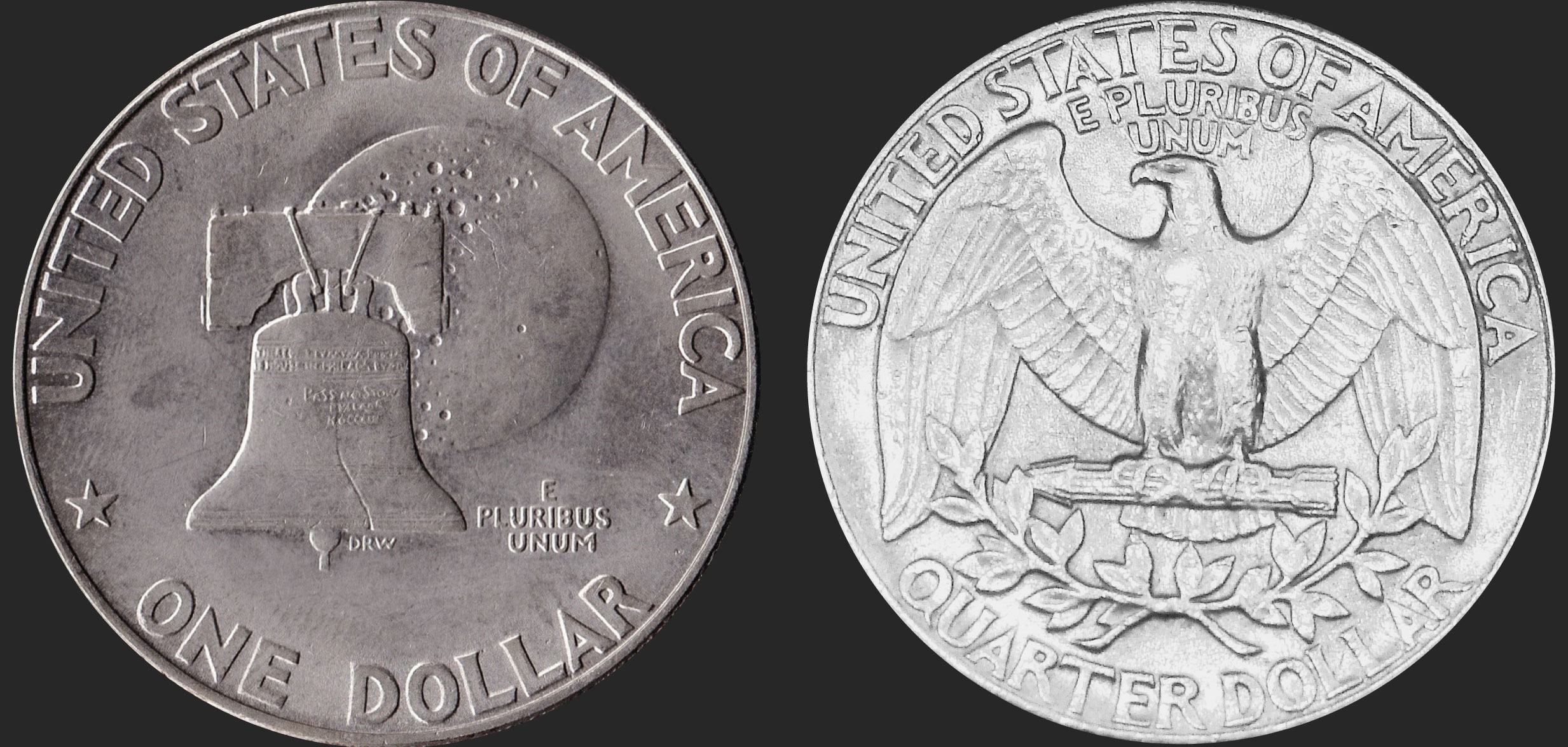
Trust functions as a survey of 20th century typography through a largely American filter of 1960s and 70s phototype. The original inspiration comes from US coin designs, and is also influenced by a multitude of typefaces from the pre-digital era. In different corners of its design space, Trust evokes classics including Friz Quadrata, Albertus, Serif Gothic, Kabel, Tempo, and Optima, and can even conjure Broadway or ITC Americana in the extreme styles. The unifying motif of Trust is the sharp diagonal shape of characters like AMNVWvw, an element which comes from the reference coins, displayed on the reverse side in “UNITED STATES OF AMERICA.”

The Trust Collection is highly flexible, with many alternates to further refine the voice of the fonts, including conventional flat forms for the diagonal AMNVWvw shapes, decorative numbers, and schoolbook agy alternates, among others. With a wide range of stylistic options to choose from, Trust can be used as a display typeface for many different kinds of editorial, branding, and other graphic design applications.
Read more about the inspiration and design process behind Trust in the Trust Essay.
Designed by Jeremy Mickel
with assistance by Graham Bradley,
Douglas Hayes, and Sabina Chipară
