Trust
Trust is a collection of display typefaces comprising 144 styles across 9 families. The fonts are organized along a continuum of sans to serif, low to high contrast, and light to black weights, in roman and italic styles.
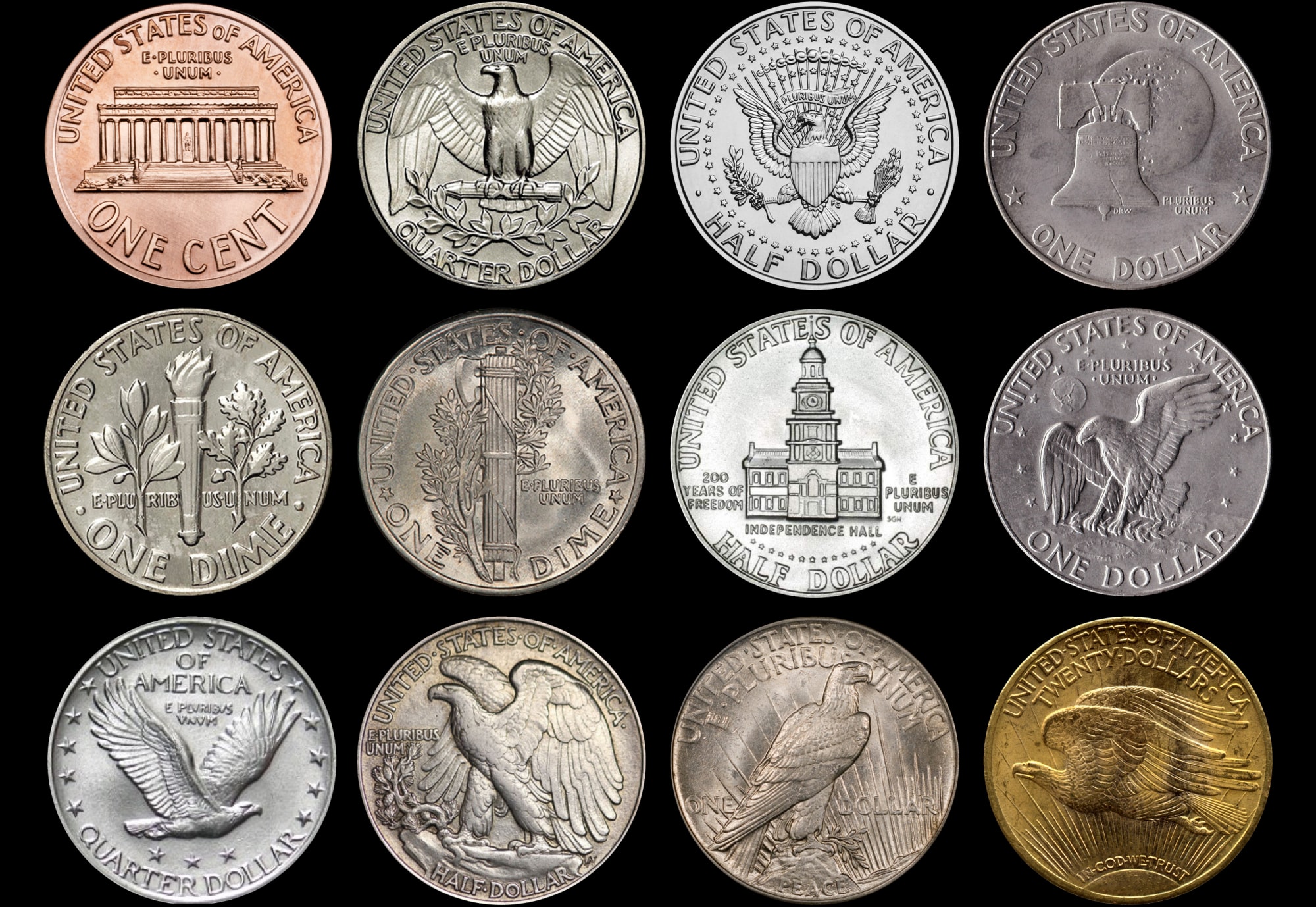
Trust functions as a survey of 20th century typography through a largely American filter of 1960s and 70s phototype. The original inspiration comes from US coin designs, and is also influenced by a multitude of typefaces from the pre-digital era. In different corners of its design space, Trust evokes classics including Friz Quadrata, Albertus, Serif Gothic, Kabel, Tempo, and Optima, and can even conjure Broadway or ITC Americana in the extreme styles. The unifying motif of Trust is the sharp diagonal shape of characters like AMNVW, a concept which comes from the reference coins, displayed on the reverse side in “UNITED STATES OF AMERICA.”
The story of Trust is a long one, stretching back over 15 years ago to the beginning of my career as a type designer. My first typeface, Router, was inspired by lettering found in the NYC subway on an informational sign carved into plastic. Suddenly, type was all around me and I began searching for new ideas everywhere.
Not long after I started drawing I picked up a souvenir coin that had been flattened through a penny press. I noticed the ghost lettering from the original coin and started to wonder about the origins of its design. Could US coin typography serve as source material for a new typeface idea? I went on a deep dive of internet resources (as available in 2007), downloading a trove of images and organizing the results.
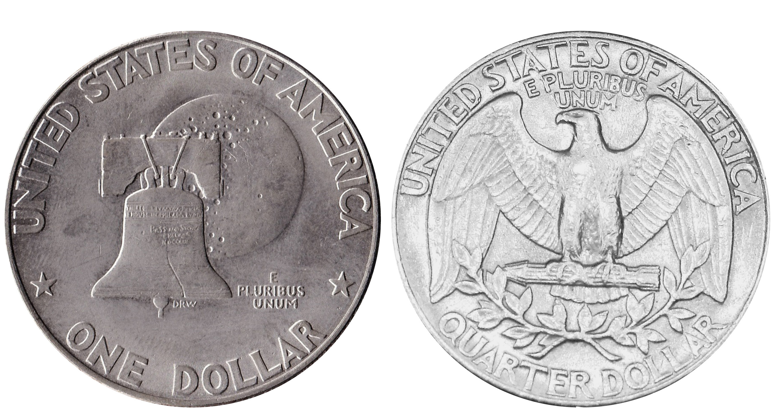
Trust was inspired by lettering on the Bicentennial Dollar (1975), designed by Dennis R. Williams, and Washington Quarter (1931-1998), designed by John Flanagan.
Coins have a special significance for me. My father and maternal grandfather both collected coins, and I still have a commemorative coin set from my birth year. Several coins from that set have unique reverse sides to celebrate America’s Bicentennial (1976). The Eisenhower dollar is especially striking, with the liberty bell and moon on the reverse and wacky sans serif lettering along the perimeter. Years later, I learned there was an extra layer of intrigue to this coin — there had been two versions of the back, one in sans and another in a more traditional serif.
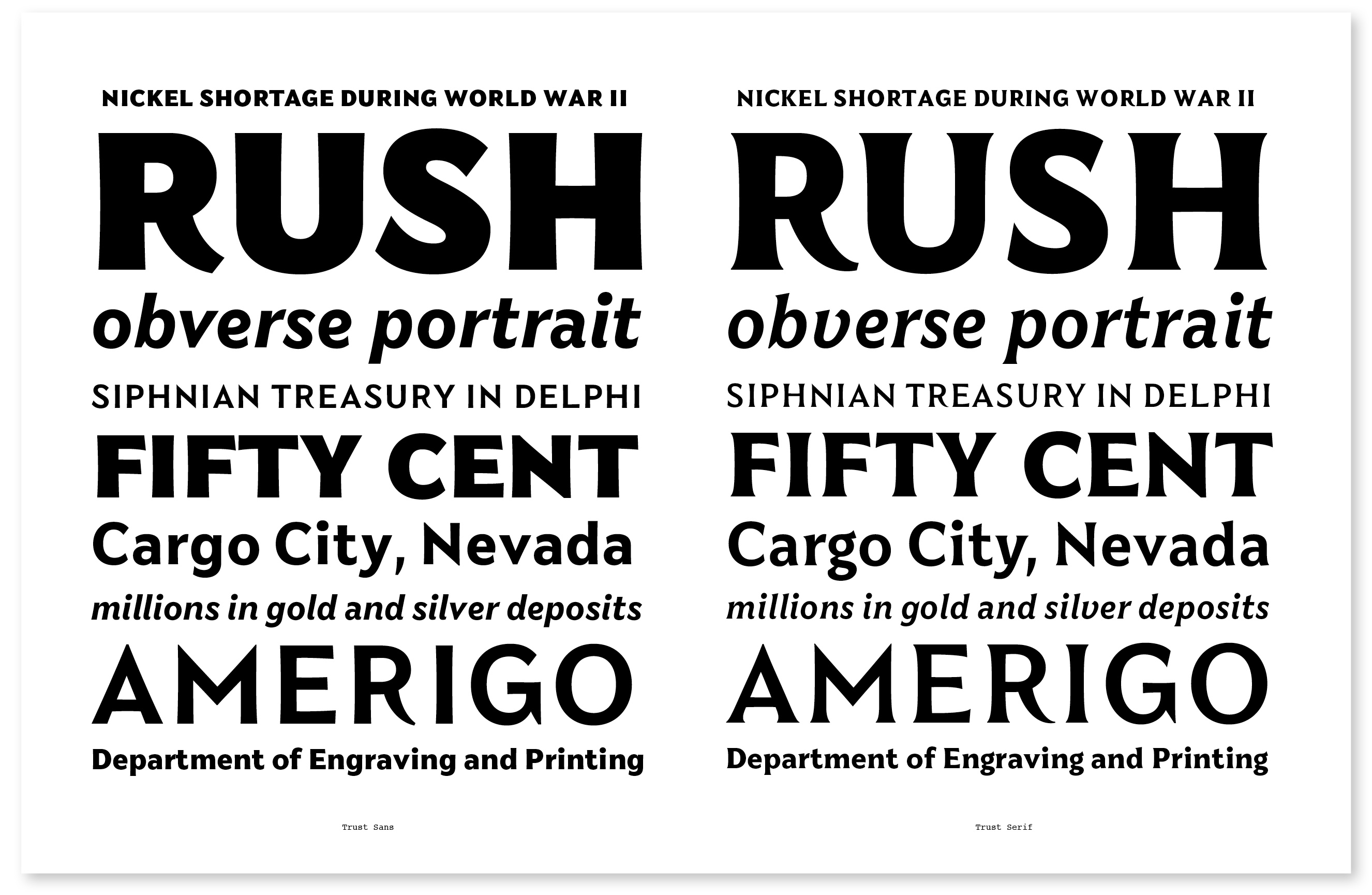
The first full draft of Trust, from 2009
I started sketching capitals inspired by my favorite images from the coin research, focused specifically on the 1976 dollar and the 1931-1998 quarter. There were stylistic similarities between the two coins, especially the sharp diagonals in AMN and the idiosyncratic tails on R. An opportunity to release an early version of Trust emerged, but in the end I held off. The kernel of the idea was there, but the drawing just wasn’t ready.
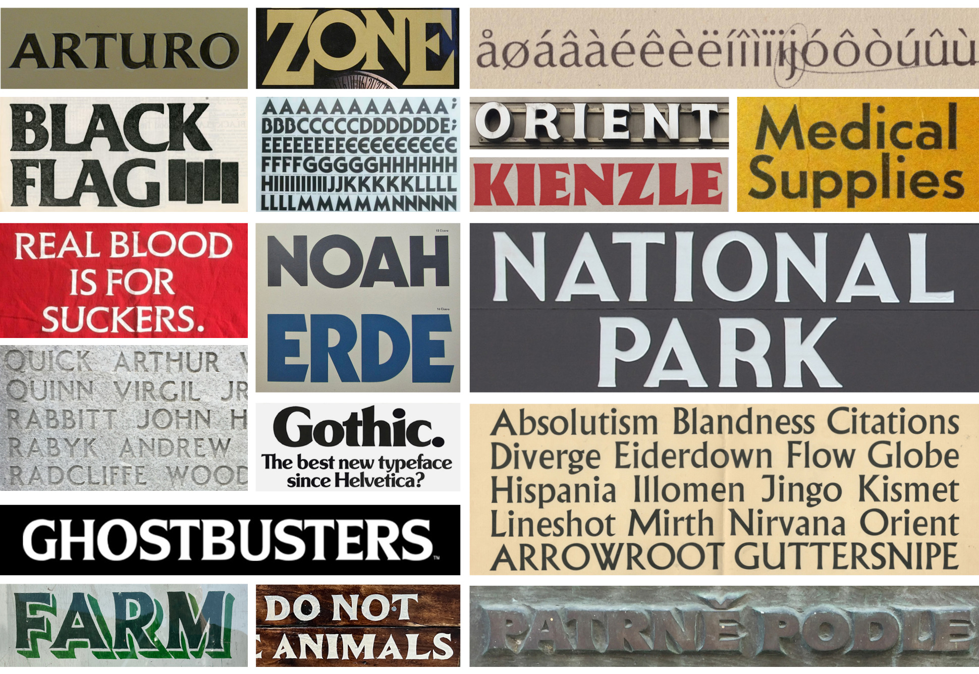
Additional inspiration for Trust, with typefaces including Friz Quadrata, Elan, Serif Gothic, Cortez, Kabel, Souvenir Gothic, Optima, Koch Antiqua, Tempo, and Albertus.
Over the next decade, I kept coming back to Trust, trying to figure out how to make it work. By 2019 I had a small team, and we reviewed all of the drafts from over the years and sketched new ideas as well. Finally, something clicked and I was able to combine elements of the coins with other references to create something new.
Trust is a synthesis of the coin lettering and classic typefaces from the phototype period as well as other references like 70s book covers, horror movie posters, national park signage, and other ideas of Americana.
Along the way, a couple of my favorite clients requested versions of Trust, which helped advance the design. Pentagram used the fonts for the infamous 2020 Presidential Debates, and Public Address commissioned a custom version for their MGM Brand Identity (as seen in “ARS GRATIA ARTIS” and “TRADE MARK” in the iconic lion-roaring logo sequence).
Finishing any typeface can take a long time, and there were two breakthroughs relatively late in the creative process which finally brought the design over the finish line. First, I drafted a higher contrast version of the serif styles to further differentiate them from the sans. I immediately missed the low contrast serif, but it made me realize that the system wanted to be bigger.
The addition of a contrast axis accessed a much wider range of typographic styles, making for a more flexible family that can be dressed up or down and combined to achieve many different voices.
And second, I always intended to include sharp alternates of the AMNVW characters as an homage to the coins that inspired me. I included more conventional flat forms of AMNVW as the default, thinking it would make the family more appropriate to a wider range of situations. With the addition of the contrast axis, I found that the conventional forms lacked a strong enough point of view to hold the entire family together. Trust needed a visual cue that would unite the styles, and the sharp diagonals were the perfect element.


The final version of Trust includes 144 styles, spread across 9 families, which can be used at a range of sizes.
I’ve always loved the name Trust for this typeface. It was originally in reference to “In God We Trust”, the motto of the United States that appears on all currency, as well as the concept of a financial trust. I also liked that it felt friendly, the idea of ‘trust’ as an emotional state between people.
The name “Trust” has another layer of meaning – a repository, a survey of the rich history of typography across the 20th century.
Scratch off cards with an alternate R.
Trust’s alpha-numeric naming convention (1A, 2B, 3C etc.) is an homage to the coin grading and edition numbering from my childhood coin collection. Not only do the numbers provide a nice way to keep the families organized in the font menu, but there is the added bonus that Trust N° 1 read as “Trust No One”.
We worked with Public Address and Dazzle on the marketing for Trust. Public Address came up with the concept for a coin and scratch off cards, and Dazzle helped with additional social media content. Tommie Geraendts animated a 3D coin that celebrates the design of the typeface.
Thank you for reading. I hope you enjoy Trust, and that it’s been worth the wait.
Trust, designed by Jeremy Mickel, 2009-2023.
Published by MCKL and available exclusively at MCKLtype.com.

