Bon Appétit, 2022
Design direction by Arsh Raziuddin and Caroline Newton
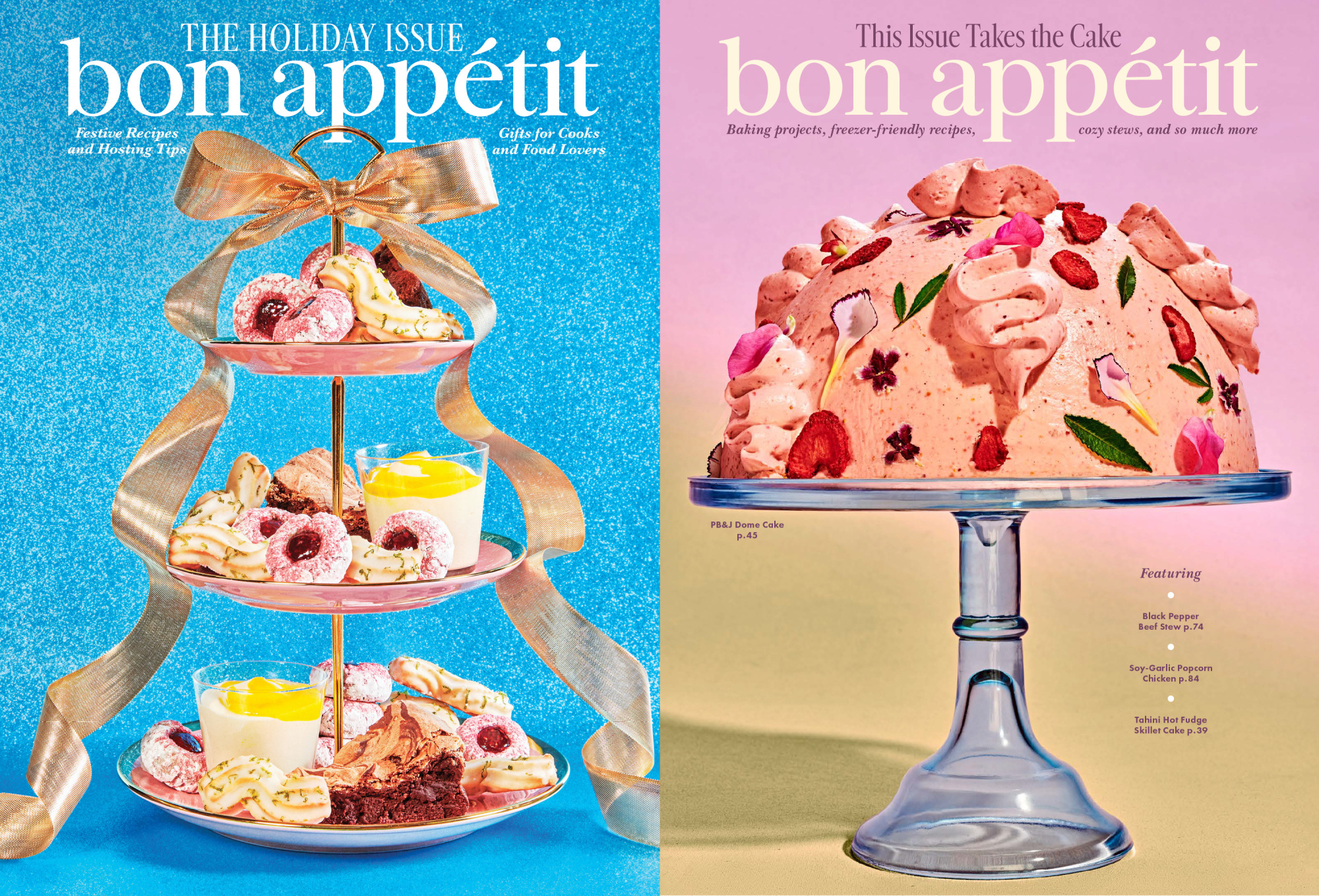
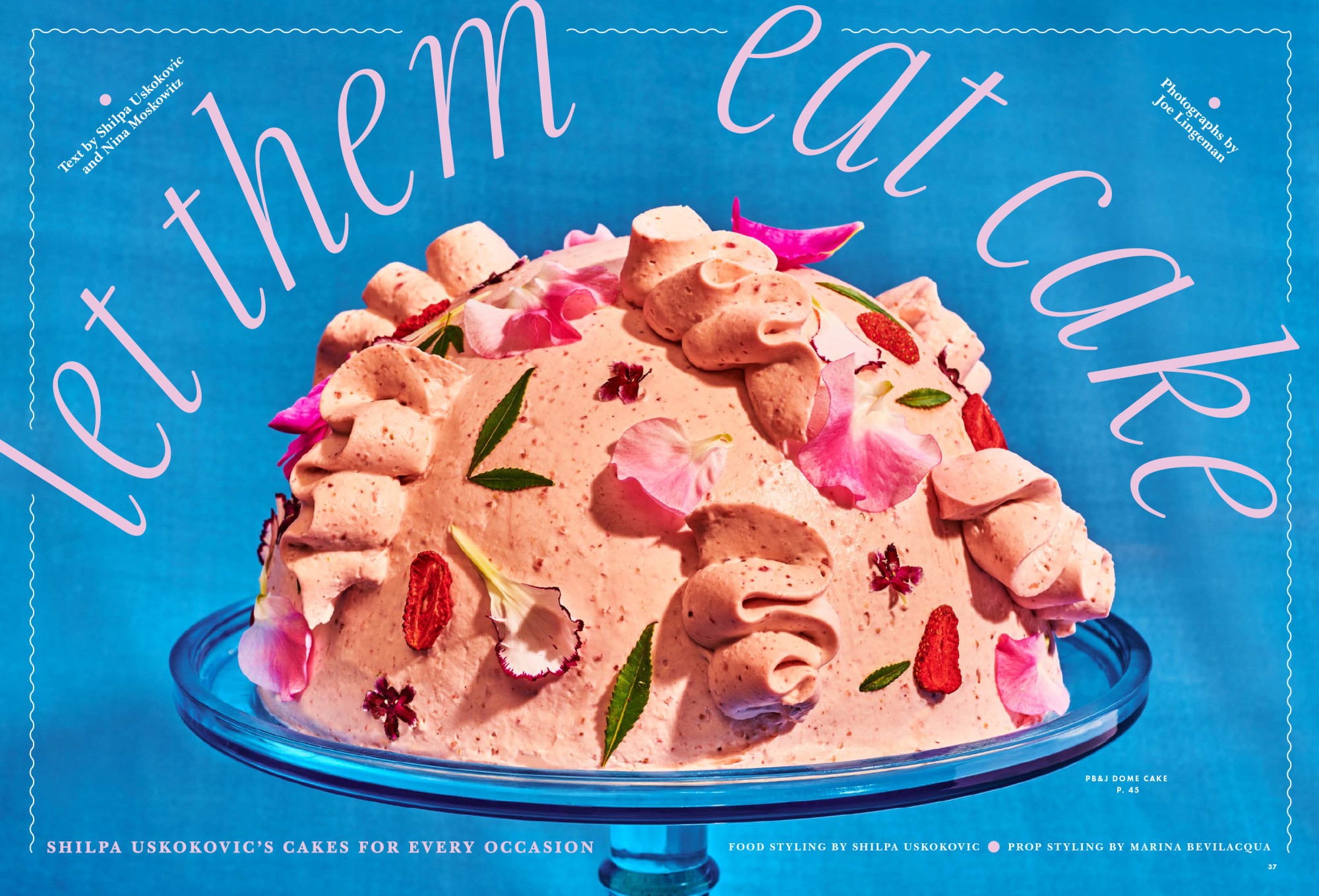
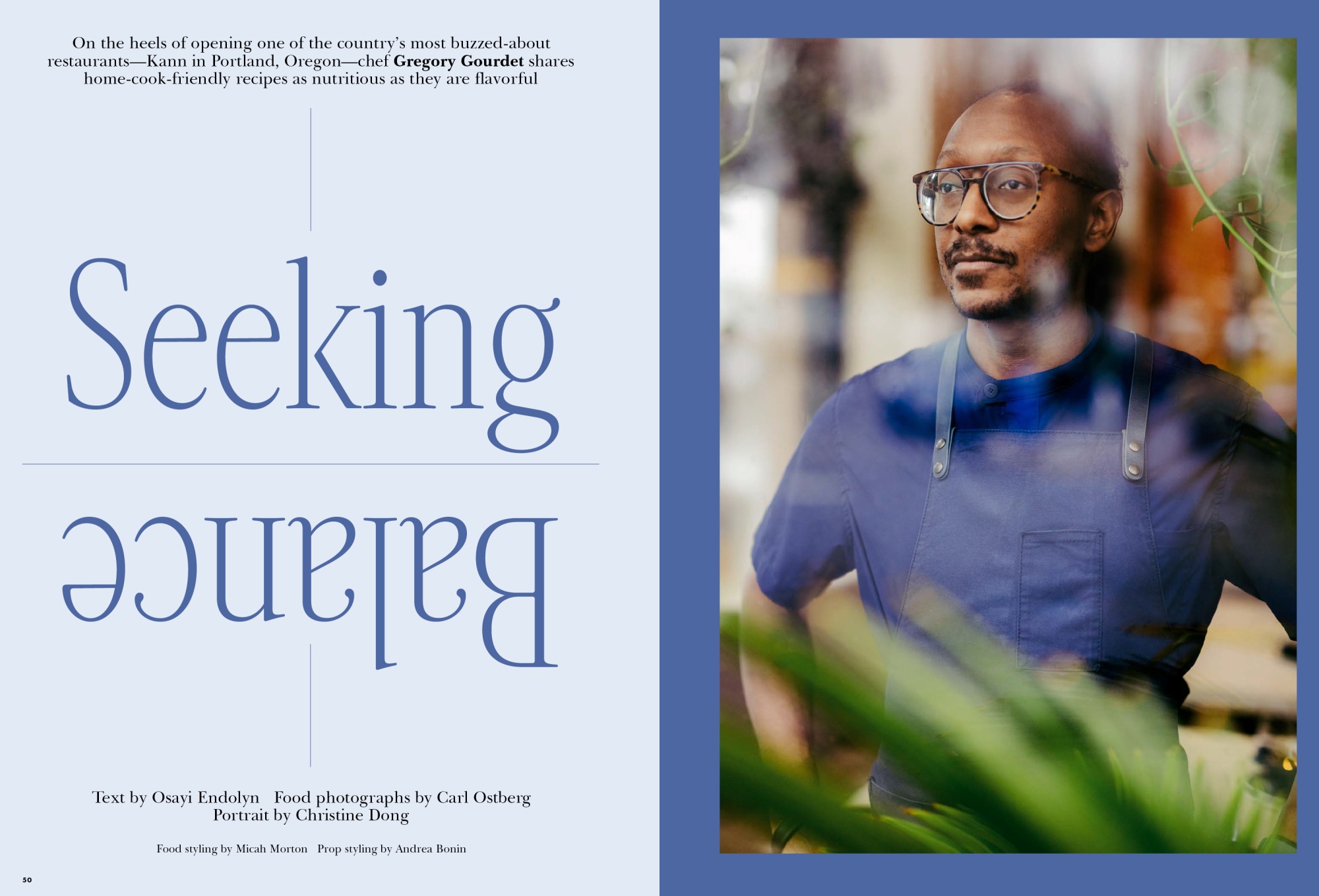
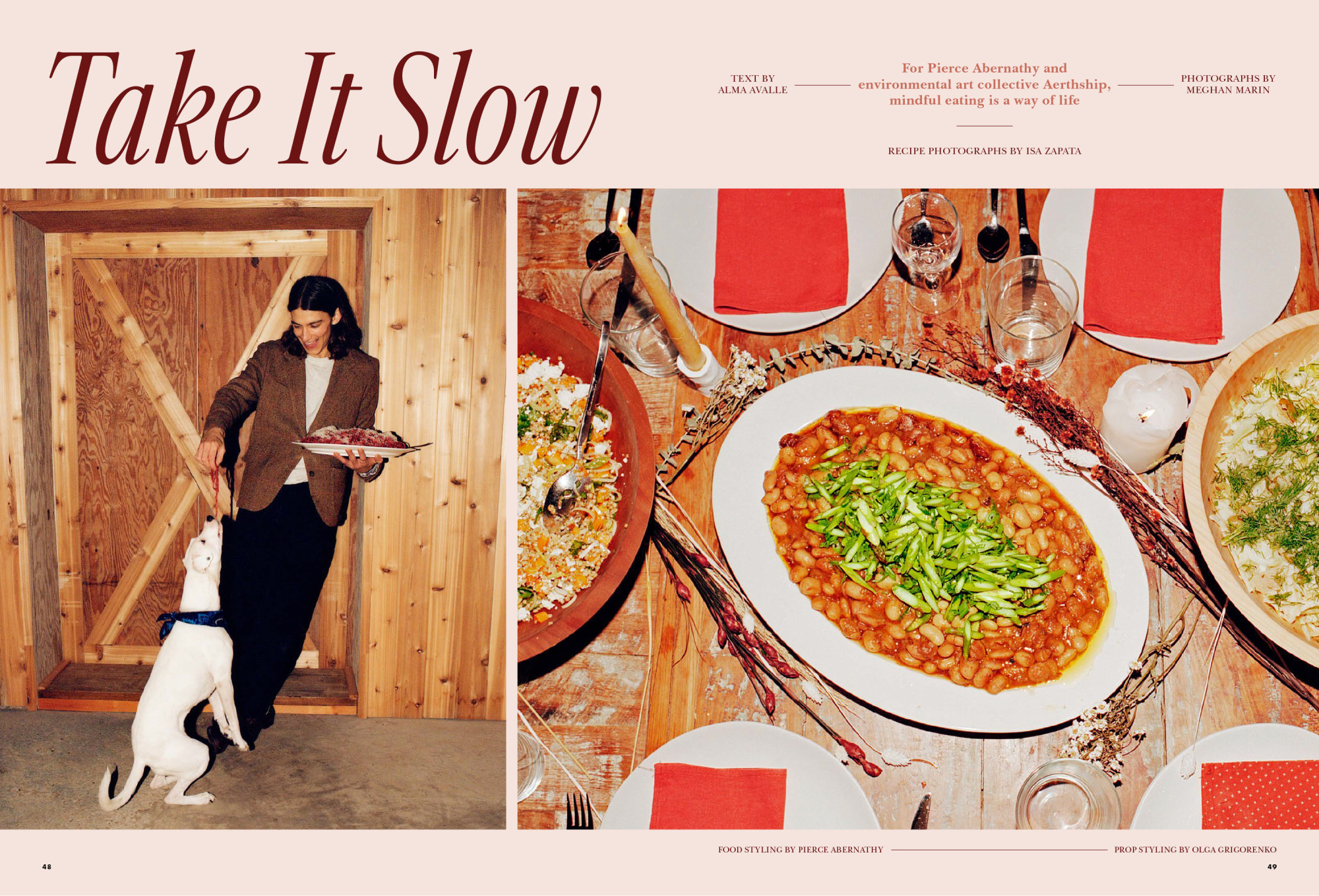
We worked with Bon Appétit to create a new logo and custom typeface for the magazine. We were inspired by the team’s bold and iconic image-driven approach to cover design and the nostalgic wink of the 50s & 60s cookbook photography style. The custom typeface, Aperitif, functions as a survey of greatest hits of the phototype era.
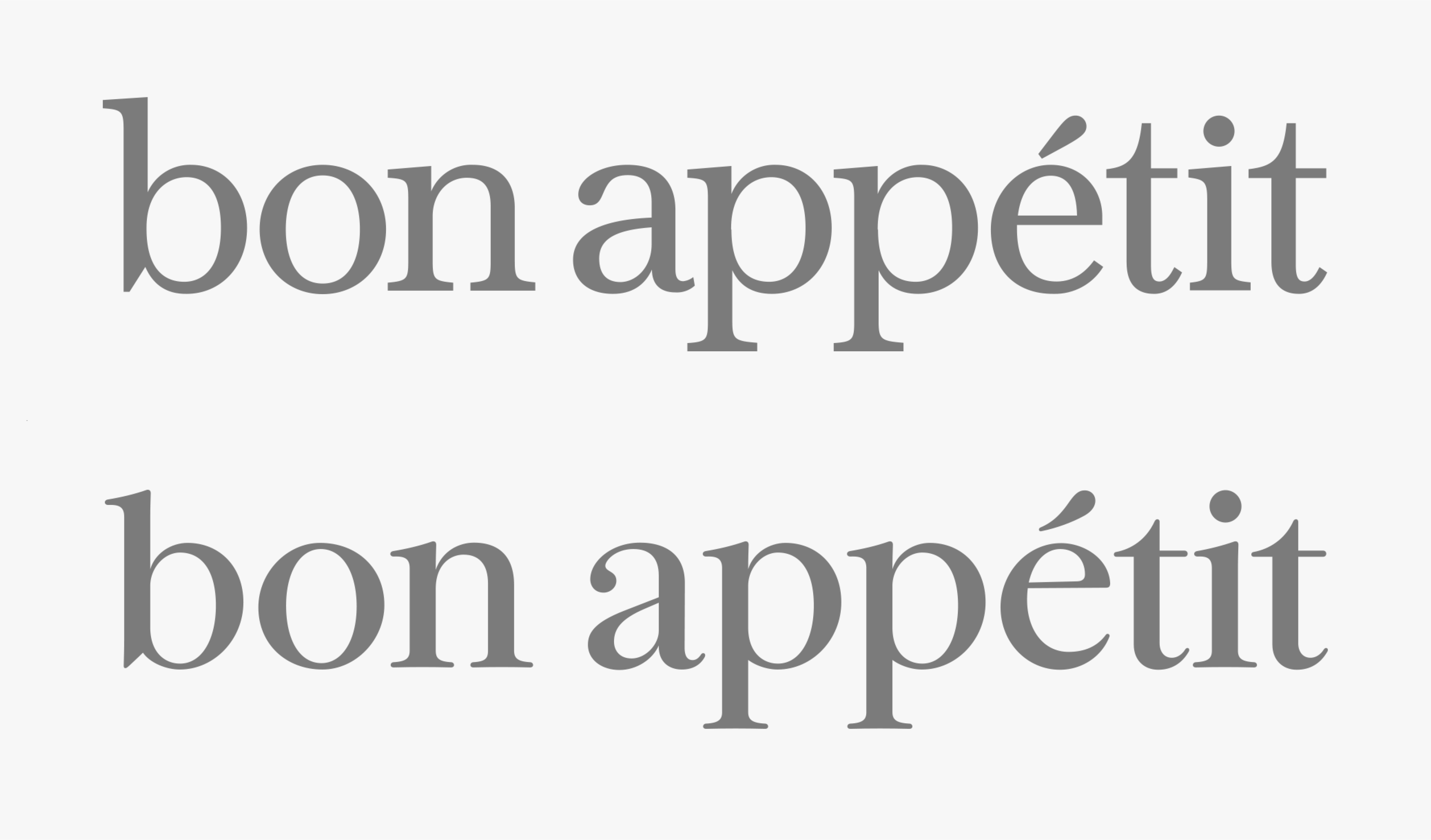
Previous and new logos
The new logo is slightly rounded, which gives the wordmark a warmer, more organic feel. We also wanted it to feel elegant and pretty, which is accomplished through the juxtaposition of high contrast strokes and fine details like the small ball terminals and flourish on the subtly curved acute accent on the é.
Images courtesy of Bon Appétit and Condé Nast
